Nature's Deformities
There is Beauty in Everything

Module 03 was my favourite among the other modules, as it gave students the independence and freedom to design whatever they pleased. It is the closest experience to being a professional designer; I envisioned the module instructions -such as the boundaries and intentions behind the design- to be given by a client, and thus the students had to design to satisfy the prerequisites set by the client.
The following video below is a brief summary of my design, and is intended to provoke feelings of happiness and comfort in the viewers as the video displays how people may use the design for their own entertainment and in different settings and environments.
Reading
Schuere & Stehling, 2011. Lost in Parametric Space. AD.
In Schurer’s text, Parametric Space, he discuss Abstraction, Reduction and Normalisation in Computer Aided Design (CAD). Using your design experience in M3, describe the process of Abstraction (in shape and detail), Reduction and Normalisation you have deployed in your design process? Use evidence (such as screenshot of your digital model or matrix) to support your argument.
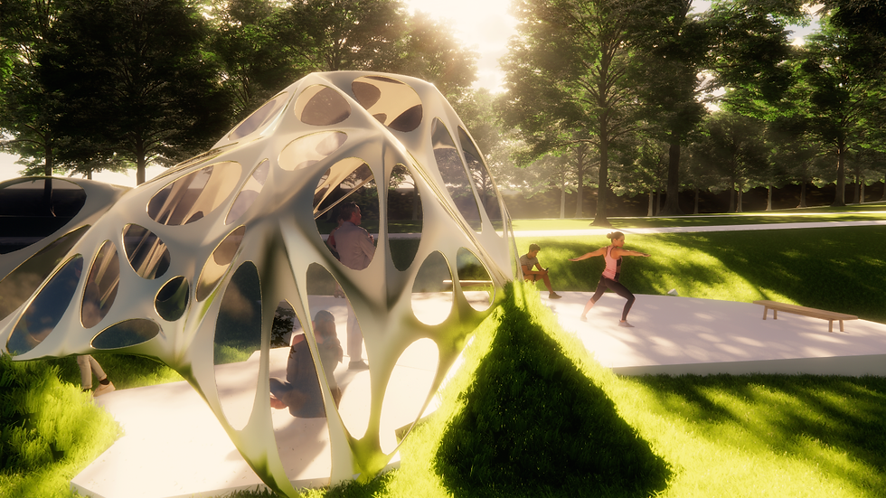
The composition/overall shape of my design intends to narrate a story of acceptance and appreciation towards deformities in the human body, mainly aimed towards physical deformities. This idea had initially developed after I was diagnosed with enchondromatosis in my left shoulder, which is a bone disorder that alters the shape of bones and makes it hollow. Inspired by the unusual shape of my shoulder, I attempted to model the shape of my pavilion after it.
Initially, I wanted to create my pavilion to be identical to the deformed shoulder bone to express my intention clearly, but after reading Schurer’s text on Abstraction, Reduction and Normalisation, I decided to take an abstract approach. In Schurer’s text, he mentions ‘Kolmogorov complexity’, also known as ‘descriptive complexity’, which in information theory is the strategy of describing and articulating a number of ideas or information in the simplest and most comprehensive way visually. Realising that at times, the simplicity of a project generates more ideas, I opted for a more simplistic design choice. Using Abstraction, I first took note of the key features of the shoulder, noting that it has many circular crevices, and had a polyhedral-like shape, having more than 1 face, and can be translated into a curved surface. Identifying these key features aided me in envisioning a shelter like structure, thus the crevices became windows in my design, and the curved surfaces became a shelter.
Schurer had also mentioned Reduction in his text, stating it to be contrasting to Abstraction as it is the design making component, where several technical design processes (such as grasshopper components and plug-ins, Rhino, and Enscape) may be utilised to create the intended design. Using the grasshopper Weaverbird and Ladybug plug-in, I tested geometry and meshes using a point grid to create the shape, and used Ladybug to optimise the design for outdoor experiences. Finally, Normalisation had helped in prioritising aspects of the design. Instead of creating the pavilion to lay flat on the ground, I decided to emphasise on the pavilions relation to nature, as the bone disorder is caused by natural factors, I instead had the landscape reach up to meet the pavilion to deploy consistency in concept and to implement Normalisation and Abstraction.
Reflection
The concept for my design is to represent the beauty in the imperfections of the human body. The composition of the overall design intends to mirror what a shoulder bone looks like as a result of Olliers disease -a bone illness-, its natural formation a result of deformities within the body. Rather than displaying this deformity as somewhat monstrous or burdening, I’ve intended to spread positivity of lifes unexpected twists in my design.
I had created my two entrances to my pavilion, one at the back facing towards open land and one facing the concrete seating area. This was intended to create an experience where people may journey through open areas, to closed areas, as well as contrasting a built form to nature. This is intended to represent nature’s portrayal of beauty in a number of ways.
The threshold and circulation varies due to different times of the day. For instance, during hot days it would be more likely for an accumulation of people to gather under the pavilion, safe from the sun or wind, and for people to walk through the pavilion as relief during the hot days. People may also gather around and move around the concrete area during events held at the pavilion.
I had decided to use the Weaverbird and Ladybug plug-ins in Grasshopper in order to develop my design intentions. Using weaverbird, I used a grid of points to create the overall composition of the pavilion, and then had created a frame to create the meshes, as well as to thicken the pavilion. Ladybug was deployed in order to test the sun path and radiation of the design, which had encouraged me to include the windows on the pavilion as a function.

Isometric:
To create my drawing, I first identified the components that make up my pavilion, that being the metal structure, and the windows. As the pavilion rests on some mounds of dirt, I decided to highlight that feature also as it is part of the makeup for the function, and overall composition of the design. Thus, I grabbed a rendered image to include an overview of shadows in my design, as well as a 2D sketch (using Make2D command).
In my drawing I wanted to highlight how the pavilion meets with the ground, emphasising the pavilions role in terms of its connection with nature, as the natural environment plays a role in creating physical deformities.
The key elements detailed in this drawing is the structure of the pavilion, the glass panes/windows, the ground, and the concrete seating area.
The pavilion is intended to hold the shape of a bone deformity -Enchondromatosis- on a shoulder, having multiple holes and being hollow to allude to the symptoms of this disorder.
The glass is particularly important, as it creates views from the interior of the pavilion looking out to the garden, creating this feeling as if one were to be inside as well as outside simultaneously.
Furthermore, the ground is extruded at certain areas to deliberately connect with the pavilion, as well as acting as support.
The concrete viewing/seating area contrasts to the pavilion, being exposed and open to the garden, whereas the pavilion is concealed and provides shelter from onlookers. This area intends to create a space where people may rest and view events occurring at the pavilion, or simply to connect with the pavilion without having to physically enter it.


The circulation and threshold diagram depicted above highlight the potential paths people may venture on. It predicts that people will use the front and back entrances to pass through the pavilion, as well as showing how different areas may attract crowds depending on the time of the day.
Iteration Matrix


Textures and Materials:
As this piece is related to acceptance, and to embracing natural beauty, no matter how different that beauty may be, I decided to settle for materials that would represent this idea and choose materials that are capturing, enriching, and aesthetically pleasing. I chose a polished gold material for the ‘shell’ of the pavilion. This material is meant to be symbolic of the ‘beauty’ aspect of the design, and also plays a role in speading the intentions of the design by reflecting its natural surroundings -as well as people’s reflections.
The glass is tinted black to act as protection from the sun. As previously mentioned, the use of glass is for the purpose of creating an experience with the pavilion, where one may feel as though they are inside and outside of the pavilion simultaneously. Finally, the concrete of the seating/viewing area is simpler in terms of aesthetics as to make sure attention is directed to the pavilion. It is also a good heat insulator, and during colder months can retain absorbed heat for people when they sit on it.
Post-processed Images:


The above images were selected as they had depicted the mood and angle that would give a realistic experience upon viewing the images, and edited to enhance the colours.
From the object-ID, Material-ID, and Depth Channel images, I was shown which areas of my renders would require further enhancing to seem as realistic and pleasing as possible. One editing issue I noted in my renders was that the sky seemed too dark, and though having ample lighting, the environment also seemed dark.This was also discovered when viewing my object-ID, Material-ID, and Depth Channel images. Using Photoshop, I had altered the saturation, and added a green hue/tint to my images, as well as a yellow one to add more warmth, and to create a more realistic aspect to the renders.
Final Thoughts:
Digital Design was among one of the most interesting subject I had taken. I personally had gained a lot from the subject, and from each module. From module 1 I learned of the variations of pavilions, and learned the experiences gained from threshold and circulation. From module 2, I was introduced to parametric design and grasshopper. This was challenging to me, as it was a scripting software and was entirely new to me. Module 3 was an extension of module 2, however was intended to allow students to have a more independent approach to the assignment. I believe this subject was challenging, and also very beneficial on the long run.